Fiscora
Financial analysis usually means exporting data into a spreadsheet, guessing which chart type actually tells the story, and rebuilding that chart every time the underlying numbers change. I wanted to see whether Claude's tool-use could remove that entire manual step: upload a raw file, ask a question in plain English, and get back the right chart, not just a text answer.
The technical challenge was giving Claude structured tool definitions for six different chart types, line, bar, multi-bar, area, stacked-area, and pie, and trusting it to choose the right one, shape the data correctly, and hand it off to a live rendering layer, all while also handling multimodal input, since some source data arrives as PDFs or photos rather than clean CSVs.
Right Chart, Not Just an Answer
Claude has to infer which of six chart types actually fits the question, not just describe the data in text.
Multi-Format Input
Source data arrives as CSVs, PDFs, and even photos, each needing a different extraction path before Claude can reason about it.
Tool Use to Live Rendering
Claude's structured tool call has to map directly onto a real charting library with zero manual data reshaping.
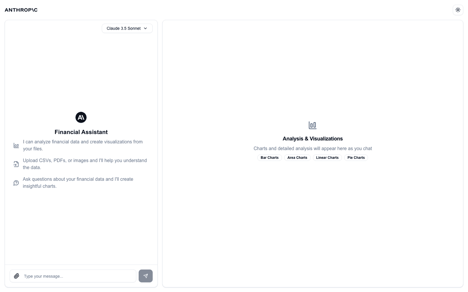
I built and ran this locally by adapting Anthropic's open-source "Financial Data Analyst" quickstart, a Next.js app that pairs a Claude 3.5 Sonnet chat interface with a live visualization pane. Every message is sent to Claude with tool definitions for six chart types; when Claude decides a chart is the right response, it calls a generate_graph_data tool with structured JSON, which the frontend renders instantly with Recharts, no manual charting step, no separate BI tool.
Chat-Driven Data Analysis
Ask a question in plain English, upload a file, and Claude decides whether the right response is text, a chart, or both.
Six Structured Chart Types
Line, bar, multi-bar, area, stacked-area, and pie charts, each backed by a dedicated tool definition Claude calls with shaped data.
Multimodal Input Handling
CSVs, PDFs, and images all feed into the same conversation, letting Claude extract and visualize data regardless of source format.
Instant Live Rendering
Claude's tool call maps directly onto Recharts components in the UI, turning a structured response into a rendered chart with no manual step in between.
A Closer Look
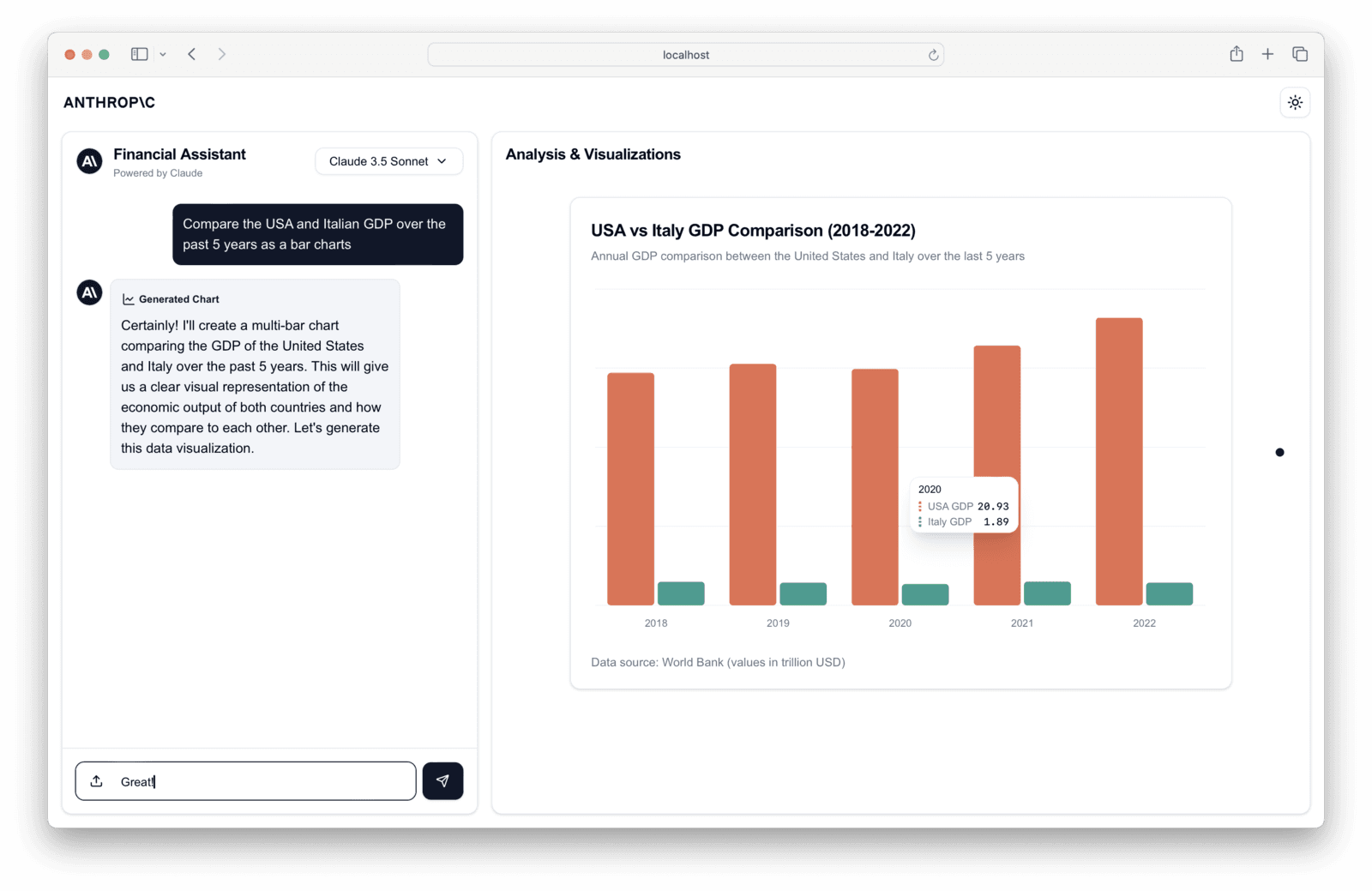
Claude-Generated GDP Comparison Chart
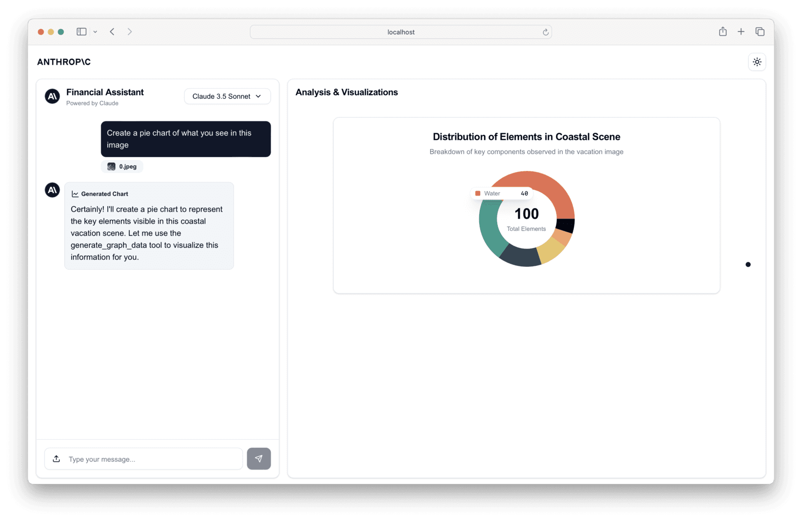
Multimodal Image-to-Chart Analysis
As a personal exploration rather than a client build, Fiscora proved out how far Claude's tool-use goes past simple chat responses, from a coastal vacation photo turned into a pie chart of scene elements to a five-year GDP comparison generated from a plain-English request. It's a working demonstration that the Claude API can own the decision of how to present an answer, not just what the answer is.
“I wanted to push past basic Claude chat completions and see whether tool-use could genuinely replace a manual charting step. Watching it pick the right chart type on its own, bar vs. pie vs. stacked-area, based on nothing but a plain-English question, was the moment it clicked that this isn't just a toy demo pattern.”